
Visualizing US Biomass
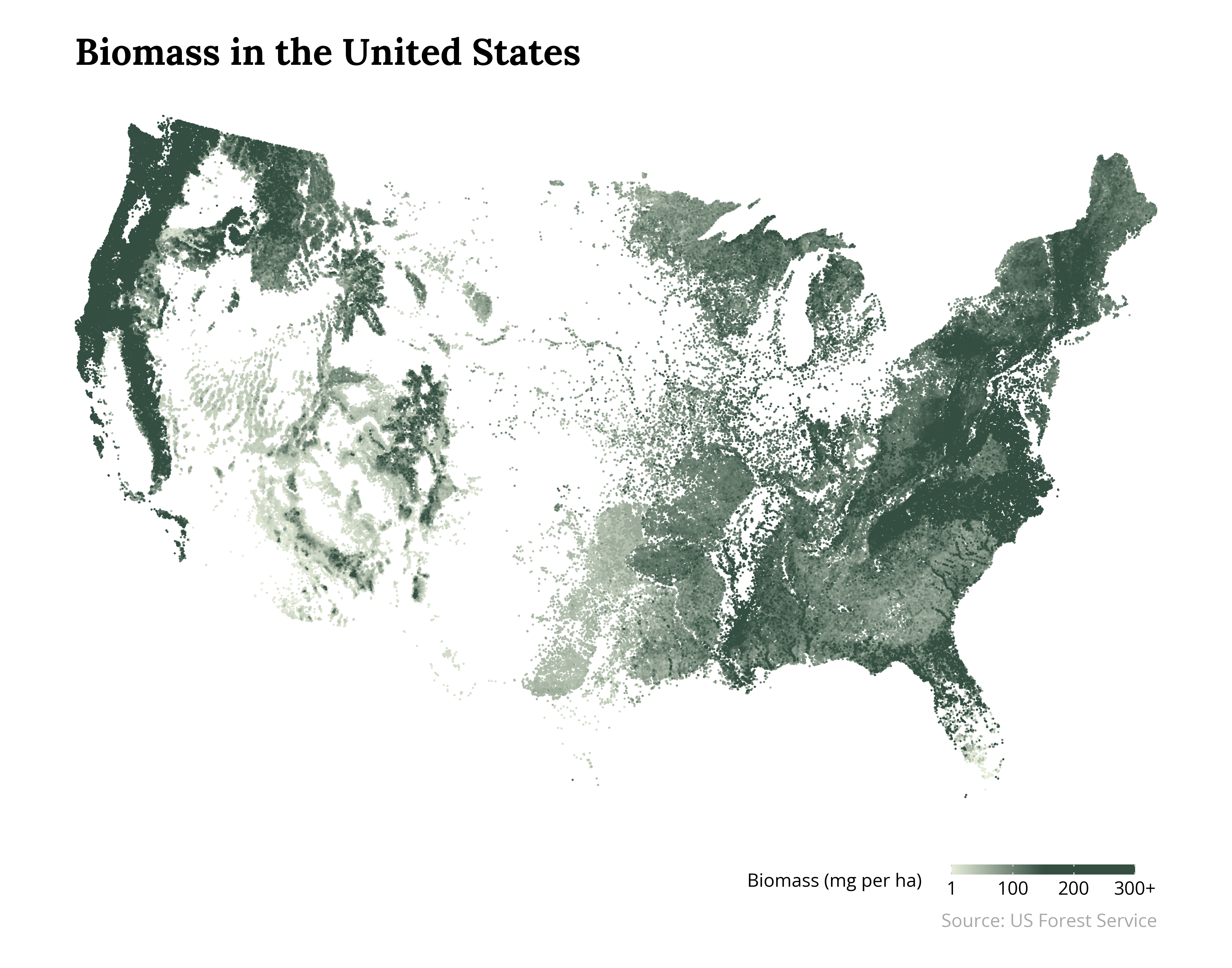
I am facinated by trees, forests, and woods. The United States is home to a vast array of forests, deserts, and plains. While the eastern US is dominated by deciduous forests, the central plains are comparatively bare. And the western US is dominated by stark contrasts; the Central Valley of California is effectively bare (flat plains used for farming) but the Sierra Nevada mountains are home to massive Sequoia trees where the coast ranges have the Redwoods (the largest trees on earth).
The map below shows relative biomass (the megagrams per hectacre) over a grid. Larger values indicate higher “weight” estimates of trees and vegetation over the land. Note that the large biomass does not always mean lush. For example, the woods of Maryland feel more lush than the woods of the Sierra Nevada in California but the Sierra Nevada has higher biomass because of the sheer size of the massive coniferous trees.
The map below is made with data from the US Forest Service.
#### Setup ####

import rasterio

import numpy as np
import polars as pl
import plotnine as p9

from pyfonts import load_google_font

LIGHTGREEN = "#e6edda"
DARKGREEN = "#344e41"

EXPANSION = 500
MAX_BIOMASS = 300

#### Load Data ####

with rasterio.open("conus_forest_biomass_mg_per_ha.img") as src:
    bio_array = src.read(1)
    rows, cols = bio_array.shape
    ys, xs = np.mgrid[0:rows, 0:cols]

bio_data = (
    pl.DataFrame({
        "x": np.array(xs).flatten(),
        "y": 0 - np.array(ys).flatten(),
        "biomass": bio_array.flatten()
    })
    .filter(
        pl.col("biomass") > 0
    )
    .sample(
        n=250_000,
        seed=42
    )
    .with_columns(
        pl.min_horizontal(
            pl.col("biomass"),
            pl.lit(MAX_BIOMASS)
        ).alias("biomass")
    )
    .sort("biomass")
)

#### Plot ####

serif = load_google_font("Lora", weight="bold")
sans = load_google_font("Open Sans")

serif.set_size(30)
sans.set_size(15)

plot = (
    p9.ggplot() +
    p9.geom_point(
        data=bio_data,
        mapping=p9.aes("x", "y", color="biomass"),
        size=1e-5
    ) +
    p9.coord_fixed() +
    p9.scale_color_gradientn(
        colors=[LIGHTGREEN, DARKGREEN, DARKGREEN],
        breaks=[1, 100, 200, MAX_BIOMASS],
        labels=["1", "100", "200", f"{MAX_BIOMASS}+"]
    ) +
    p9.labs(
        color="Biomass (mg per ha)",
        title="Biomass in the United States",
        caption="Source: US Forest Service",
    ) +
    p9.expand_limits(
        y=(
            bio_data.get_column("y").min() - EXPANSION,
            bio_data.get_column("y").max() + EXPANSION
        )
    ) +
    p9.scale_x_continuous(
        expand=(0, 0)
    ) +
    p9.scale_y_continuous(
        expand=(0, 0)
    ) +
    p9.theme(
        plot_margin=0.03,
        legend_key_height=8,
        legend_key_width=150,
        legend_position="bottom",
        plot_title_position="panel",
        legend_justification="right",
        axis_text=p9.element_blank(),
        axis_title=p9.element_blank(),
        panel_grid=p9.element_blank(),
        panel_background=p9.element_blank(),
        axis_ticks_major=p9.element_blank(),
        text=p9.element_text(fontproperties=sans),
        plot_caption=p9.element_text(color="darkgray"),
        plot_title=p9.element_text(fontproperties=serif, ha="left")
    )
)

plot.save(
    filename="us-biomass.png",
    height=11,
    width=14,
    dpi=300,
)